


 From there I wanted to turn it into more of a tree / leaf shape so I altered the base into a long stem. I think it really became more of a 'tree' than a 'leaf' but you get the idea. I needed to create some space where I could try and work in a quill.
 (Below) Then I tried to attach what I thought would be a quill tip or nib to the shape in the hopes that it would become something of a writing instrument. Oddly enough it started to look more and more dart-like but I just went with it to see where it lead me.
 (Below) In an attempt to make it look less dart-like and more quill-like I bifurcated it and dressed up the 'cut' line to give it some shape.

 ...and I'm still not sure what to do with it.


 Same design with a braid rather than a coil of rope as the 'edge'.
 The Green Quill - the simple icon that I had begun to use when I was working as a Scribe within the Midrealm of the SCA. Since scribes didn't sign the front of their work, the simple green quill was something that I could hide in the design somewhere on the surface. It became something of a hieroglyphic signature that I began using not just in my scribal work but also in other venues.


 Then I tried a triangle of oak leaves. That really got my attention because the interior space started to look like some celtic twist-spiral thing; a triskelion. This was a cool, if unintended design feature but it didn't look quite right. I might still use the design element - but not sure in what.
 So then I pulled an image of an envelope and added the symbols to see what the seals would look like in action.

 Pilgrim design v 2.0 with Mountain background
 Bookplate v 1.0
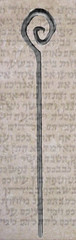
This is a Pilgrim's Crook. I am experimenting with photoshop with different layers and such.
It was just an experiment.
-T
 A lot of my sketches end up being some kind of design or blueprint; it's just how I think.